
Fitness24Seven 2.0 App Concept
A redesign of the current app of a popular Scandinavian fitness chain by making the app more accessible to all members.
Why a redesign is needed
Fitness 24/7 is one of the fastest growing fitness chains in Scandinavia, their mission is to keep expanding globally and to become an industry leader providing affordable gym memberships with high consumer value. Having been a member for a long time, I noticed considerable flaws & members around me complaining about the current app.
What are the main pain points?
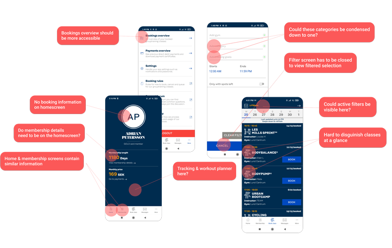
- Within the app members can book fitness classes but the booking process itself can be quite tedious as the filter screen obstructs the users view of the main booking screen forcing the user to go back and forth between filter and booking to find the desired class.
- Many members are just interested in going to the gym, myself and others around me have noticed the app really doesn't cater to other members. However occasionally you do need to check the app, check your membership status, your payments or to aquire payment receipts and then the app remains dormant in the app drawer, not to be used again until maybe a few weeks or months later.
Secondary research
In order to build a solid foundation for the project, I started by looking at Fitness24Seven's competitors to understand what functionality was currently implemented in their apps, and how they were received by users. Here I looked at reviews, ease of booking if they offer workout tracking or offer a workout planner.
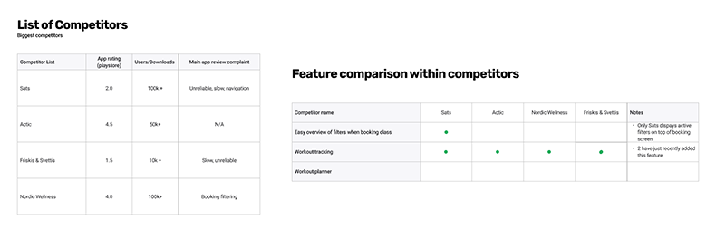
To further consolidate my understanding of the current pain-points I then took a closer look at Fitness24Seven app reviews to get a better understanding for why the app had such a low rating of 2.5 (Google Playstore).
Quotes from app reviews (Android & IOS)
- "UI does not follow any logic and feels clumsy.*"
- "I don't understand the purpose of the app? I can't find my gym, nor track workouts, nor use it to get access to the gym. Why have an app that fills no purpose? And it is slow."
- "App is useless. Only useful to book classes...You can't track your check-ins, you should add a workout schedule.**"
- "An improvement would be being able to track your workouts, which would be much more useful than it showing days being a member. *"
- "Please add booked classes to homescreen!*"
Contextual inquiries & semi-structured Interviews | 7 participants
I then conducted 4 active contextual inquiries with three users who frequently book classes and one user who has never used the app before. During the contextual inquiries users where observed when navigating the app and where given the task to book a class.
To try to identify the the needs of the gym-goer semi-structured interviews with 4 current gymgoers who do not go to fitness classes were conducted. They were asked about how often they use the app, what actions they perform using the app and what needs where currently not met.
Affinity mapping
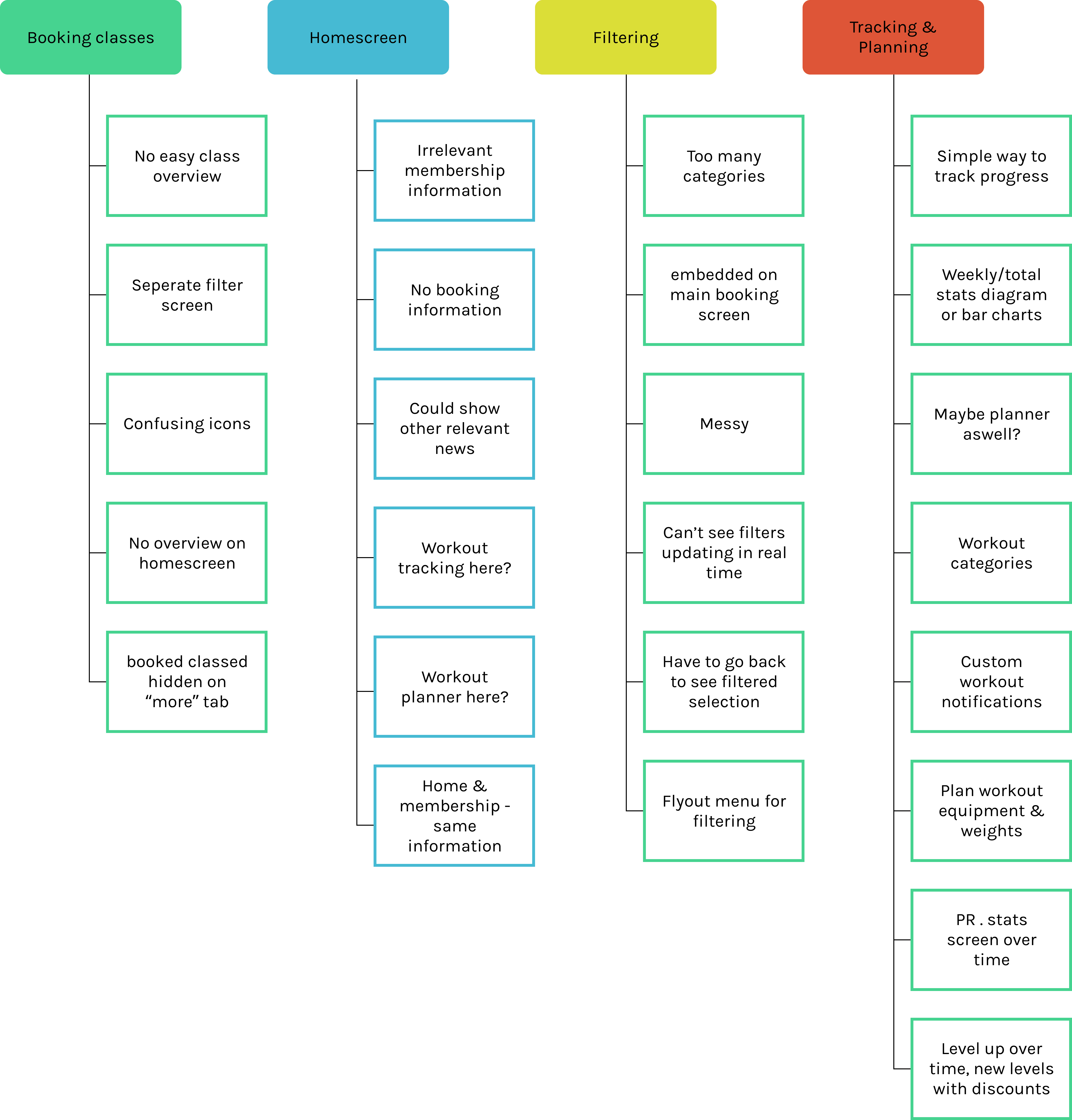
Affinity mapping was ultimately used to categorize and try to understand the gathered data, containing both user needs and current identified pain-points.
Personas
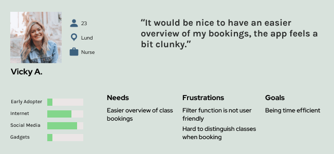
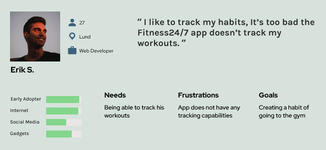
The affinity mapping process made it clear that a holistic approach was necessary in redesigning the current app by appealing to both the current main user base (booking classes) and the broadened target audience without any compromises. By creating two personas, one that frequently books classes & that only uses the gym facilities it was easier to pinpoint how and which changes would need to be implemented.
Design & wireframes
To kickstart the ideation phase I used the original app to highlight current painpoints identified throughout my research , but also to identify and envision how additional identified user needs could be implemented. It would be important to not let new additions to the app impact the overall user experience negatively by cluttering the UI.
Initial wireframes
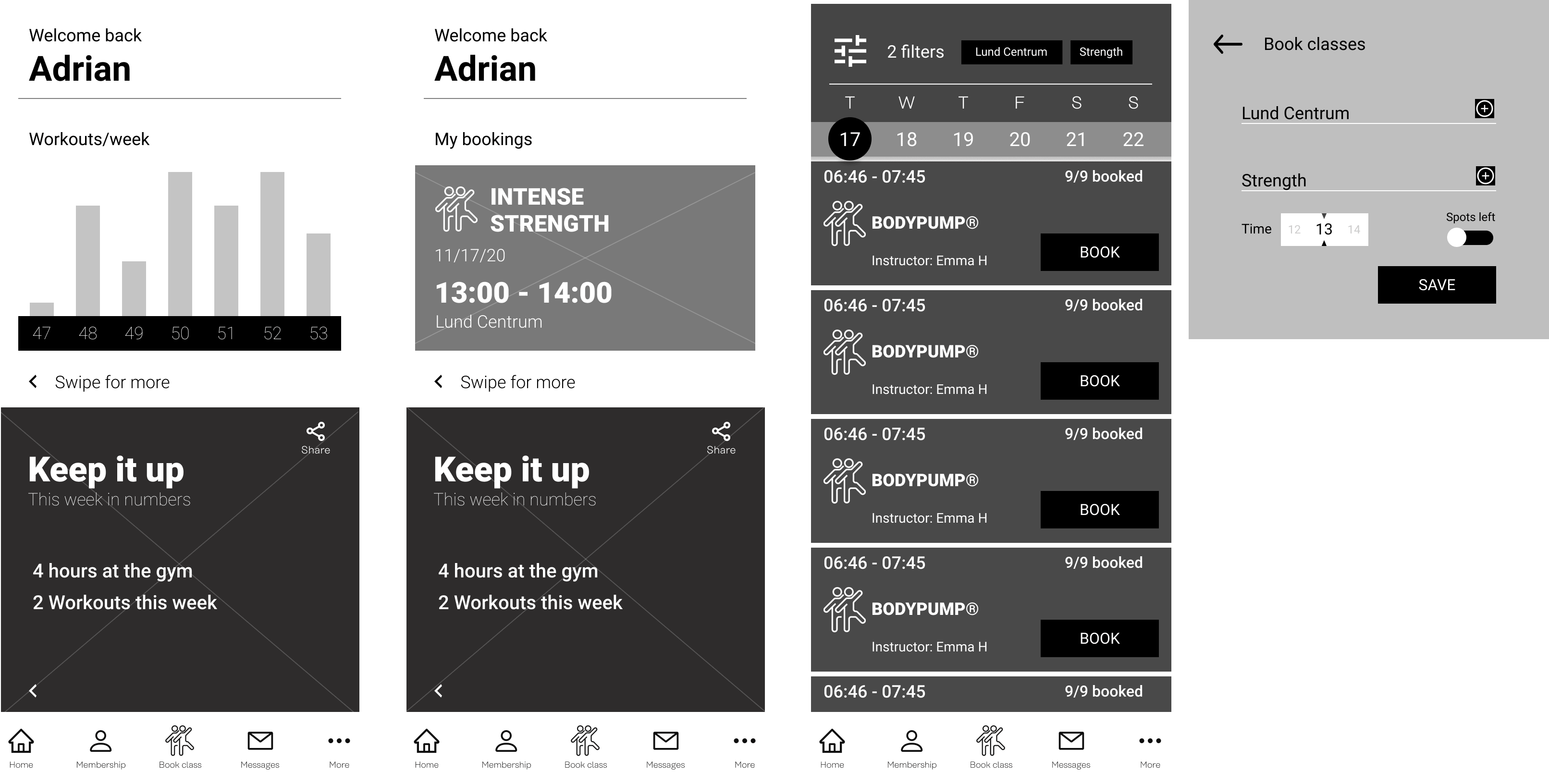
The initial wireframes focused on the homescreen and class bookings. One of the major changes are workout stats displayed on the home screen along with showing booked classes on the homescreen. In addressing the booking section I tried to implement a fly-out filter menu along with active filters embedded into the top bar of the booking screen.
User Feedback
At this point I reached out to my previous research participants by sending them a prototyped version of the above wireframe where they where asked to perform certain actions. Here, two testers who mainly use the app to book classes experienced the homescreen was now cluttered with stats which could be a stressor for certain people. Additionally, the filter fly-out was covering important content and a better class overview was still needed.
New wireframes
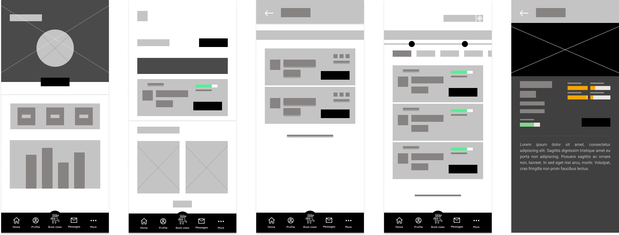
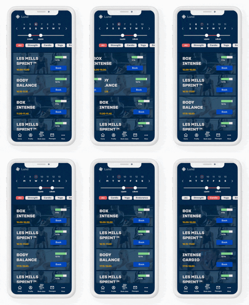
A new lo-fi wireframe was created utilizing the feedback from my testers. I removed any tracking from the homescreen and moved it to the profile screen. The Booking experience was condensed down to one screen with embedded filtering - no flyout-menu. To further assist users when selecting a class the class overview includes bar-chart based stats (e.g. class intensity). Also added was a barebones workout planner & the Home menu now includes a calendar displaying booked & planned workouts along with room for a news section (e.g. home workouts). Upon letting users revisit the wireframe & receiving positive feedback i moved forward with this concept.
The prototype
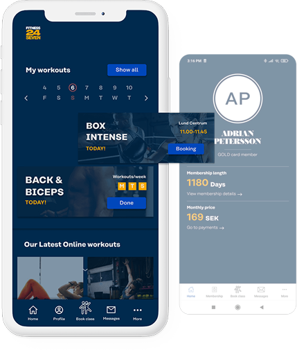
Home
Membership details were moved from the home-screen to the profile screen as this information was redundant. Newly added in its place is a simple calendar displaying workout scheduling and booked classes. The prototype also indicates how the home screen could be used to display links to external data like news or in this case home workouts.
Booking
The booking experience has been condensed down to a single screen to improve user overview and flow. During research it became clear that having a separate filtering screen was an inconvenience for many users as they would have to navigate back and forth to update the results and view active filters. The concept designed booking system enables users to easily adjust and view active filters on the booking screen itself. In addition, instead of using icons, descriptive images are used. This change was made as users indicated that the icons didn't offer much help to distinguish classes at a glance.
Profile
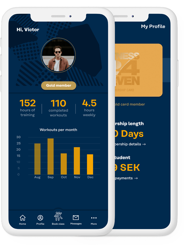
The Profile screen now displays workout statistics to keep the user motivated. The user flow has been altered with an additional screen now displaying membership information. This was done as membership information isn't necessarily essential information for the recurring user.
Workout Planner
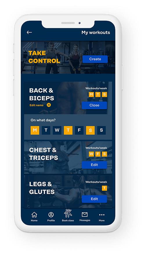
A very simple workout planning tool came to fruition to help the users stay motivated by planning their workouts. Users can add workouts & pick recurring days of the weeks for their workouts, reminders would be notification based.
Onboarding
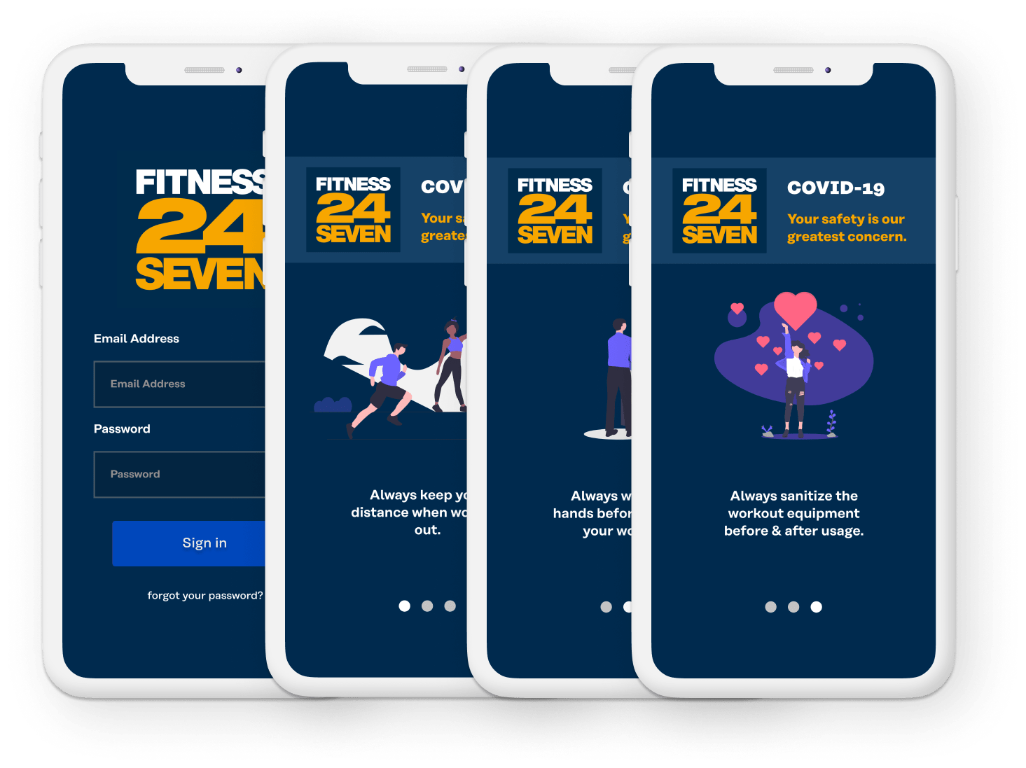
Added to the user experience was also an onboarding section displaying helpful information which could help Fitness24 reach out to their members more efficiently.
Conclusion & Reflection

Upon conducting remote usability testing where users navigated the figma prototype, users rated the usability of the concept considerably higher than the original app. Overall, users expressed that the new user experience was more fluent than the original app, with considerable improvements to their booking experiences. Having the workout stats on the profile page was also considered a working solution - they could easily be found within the app, but hidden enough for those who wouldn’t benefit from them.
Challenges
The biggest challenge by far was creating an intuitive booking experience with low-complexity. Since my direct contact with users was limited I ultimately had to make a few assumptions of how the user would book a class. Conducted contextual inquries did provide a valuable dataset, however the finished concept stayed far from the original interface and more close contact with the user throughout the final design process would have expedited the design process.
What can be improved?
The workout planner itself was a big design challenge as complexity could easily snowball and could have been adressed as a project of its own. Though users who during the research stage suggested the addition of a workout planner would help them stay motivated, expressed that the concept version was a great start, however that added functionality to the planner would make it more helpful. So one could argue the finished workout planner to be considered a MVP that would need to be refined through further design iterations.
What's next?
Since the project was conducted with a limited scope of user-testing, with a relatively small sample-size ( a total of 8 participants) further user-testing with new users would be very useful. This could provide more valuable insight into the current state of the concept and highlighted potential improvements to be made.